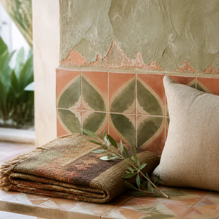
Why the best bohemian hotels abandon the neutral corporate palette
Walk into a serious bohemian hotel and the first thing you feel is color, not the thread count. The entire interior design strategy rejects the beige corporate comfort zone and instead uses a deliberate, boho-leaning color story to script your stay from the lobby to the last room. That is why travelers who crave bohemian living increasingly filter their booking search by properties where color, design and story clearly matter.
Hospitality analysts now suggest that properties with a strong, characterful design language can see guest satisfaction rise by roughly one fifth, because guests remember how a space made them feel rather than how symmetrical the decor looked. A 2023 review of boutique and lifestyle hotels by the consultancy Horwath HTL, drawing on post-stay surveys from several European and North American brands, reports satisfaction uplifts in the mid-teens to low-twenties when guests perceive the interiors as distinctive and locally rooted (Horwath HTL, “Global Hotel Design Trends,” 2023). Industry commentary also notes that roughly one third of high end properties now flirt with bohemian-inspired interiors, based on 2022–2023 pipeline snapshots from STR and JLL, yet only a fraction commit to a true boho interior where the color palettes are rooted in place, craft and narrative rather than trend boards. The gap between staged eclectic boho and authentic boho design is exactly where a discerning couple traveler needs to read between the lines of the photos.
In a genuine bohemian interior, every paint choice, every rug and each piece of wall art is part of a visual script, not a random Instagram mood. Designers use a neutral base on floors or ceilings, then add bold pigments through area rugs, throw pillows and art so the palette can evolve without losing coherence. When you compare rooms across the same property, you will often see one design style expressed in several color palettes, each room tuned to a slightly different emotional register while staying within the same bohemian style universe.
Regional color vernaculars: when place writes the palette
In the best bohemian interiors, geography is the starting point for every color palette, not an afterthought. Mediterranean properties lean into terracotta, saffron and sun-faded pinks, using limewash paint and hand-painted tiles to echo the surrounding hills and markets in every room and living room. Aegean coast hotels often reverse the script, using a cool neutral base of chalk white interior walls and then layering indigo textiles, cobalt ceramics and sea-glass greens as decor accents.
Head north and a Nordic boho interior might pivot to moss, lichen and timber tones, with mid-century chairs upholstered in forest greens and smoked grays that mirror the pine outside. Here, the bohemian design language is quieter but still bold in intent, using color and texture rather than pattern overload to create a cocooning space for winter bohemian living. In each case, the bohemian hotel interior design color palette is a translation of local light, climate and craft traditions into interior design decisions you can literally sleep inside.
Desert-facing properties in places like Palm Springs take another route, pairing palm-frond greens with sun-baked oranges and blush tones that reference both the springs and the surrounding rock. A Palm Springs suite might feature a neutral base sofa, a single saturated rug and a handful of throw pillows in citrus colors, creating a boho style that feels both retro and sharply modern. If you are curious about how these palettes interact with scent, sound and glow, a deeper dive into multi-sensory hotel design on designing for all five senses in bohemian hotels shows how color rarely works alone.
Material color versus paint: patina as the real storyteller
Color in a serious boho design project rarely comes only from paint charts, because the most memorable properties let materials carry their own hues. A brass lamp in a dim living room, a hand-knotted rug in the hallway or a row of glazed tiles behind the bar all age at different speeds, creating a shifting palette that no digital rendering can predict. Designers and hotel owners now talk about sensual sustainability, where natural pigments, recycled textiles and artisanal tiles create both environmental value and a richer interior story.
In practice, that means a bohemian interior might rely on raw linen, polished stone and reclaimed timber to set the base colors, then add paint only where the architecture needs emphasis. Area rugs in vegetable-dyed wool, wall hangings woven by local artisans and throw pillows cut from vintage fabrics all bring micro variations of color that soften any rigid design style. Over time, sunlight, touch and even cleaning products alter these surfaces, so the bohemian interiors you revisit after a few years feel familiar yet subtly re-tuned.
When you scan photos on a booking website, look for color that seems to come from depth rather than surface, such as a leather chair that has darkened at the arms or a ceramic lamp with irregular glaze. These are signs that artisans, not just interior designers, have shaped the bohemian style of the space, and that the bohemian hotel interior design color palette will keep evolving as guests move through it. For couples planning repeat stays, this living palette can be a quiet reason to return, much like booking into properties already building waitlists for peak seasons on curated lists such as bohemian hotels generating early demand.
Artisans, textiles and the hand of the maker
Behind every convincing boho interior there is usually a small network of artisans whose work anchors the palette in something irreproducible. Interior designers collaborate with ceramicists, weavers and metalworkers so that the color palettes in the rooms cannot simply be copied by a global chain with a bulk order. In many luxury bohemian hotels, the same artisan who glazes the lobby tiles also creates the bedside lamps, giving the interior design a chromatic through line that guests feel even if they never name it.
Rugs are often the quiet heroes here, because a single rug can hold ten colors and still read as one mood. In a Palm Springs inspired property, a mid-century patterned rug in rust, teal and sand might sit under a low sofa, while in a coastal retreat an area rug in washed blues and grays anchors the living room like a tide pool. Throw pillows, bed runners and wall hangings then echo two or three of those colors, so the bohemian design feels eclectic but not chaotic.
Hotel owners who take this route usually brief their équipe with one clear principle from contemporary research on bohemian hotels: "Eclectic styles using bold colors and diverse materials." That line, drawn from hospitality design analysis, captures why bohemian interiors resonate with guests who are tired of anonymous rooms. When you book, scan the photo gallery for close ups of textiles and ceramics, because those details often reveal whether the boho style is a marketing filter or a genuine bohemian living environment shaped by real hands.
The psychology of color: how palettes shape mood and memory
Ask frequent travelers how they remember a favourite bohemian hotel and many will describe a color before a piece of furniture. A saffron hallway, a jade tiled bathroom or a living room washed in deep petrol blue lodges in memory more firmly than any generic decor accessory. That is why serious interior designers in this space talk about color as a form of emotional architecture, especially when building a bohemian hotel interior design color palette for couples seeking romance or reset.
Warm tones such as terracotta, ochre and soft coral tend to make a room feel more intimate, especially when paired with low lighting and tactile rugs underfoot. Cooler palettes built around sea greens, stone grays and chalk whites can open up a compact space, which is useful in city properties where the boho interior must work hard to avoid feeling cramped. Designers often start with a neutral base on walls or floors, then add one bold accent color and two supporting shades, a simple structure that keeps even eclectic boho schemes coherent.
Color also guides behaviour inside the hotel, nudging you toward certain rituals without a single sign. A deeply colored bar with dark paint and jewel-toned area rugs invites late night conversations, while a pale, plant-filled courtyard with light rugs and soft throw pillows encourages slow breakfasts. If you want to understand how these visual cues interact with lighting, scent and sound, the analysis of invisible architecture in bohemian hotels on lighting, scent and acoustics shows how a palette is only one layer of a carefully tuned sensory stack.
How to read photos and choose your ideal bohemian color story
When you scroll through a booking website, train your eye to read color before you read amenities. Start by asking whether the bohemian hotel interior design color palette feels anchored in the landscape outside or could belong to any city in the world. If the same gray and white scheme appears in every room, with only a token rug or palm print, you are probably looking at a generic design style with a boho filter rather than a true bohemian interior.
Look for consistency without sameness, where each room has its own palette but shares a few recurring colors or materials with the rest of the property. A hillside retreat might use clay pink in the lobby, cinnamon in the restaurant and brick red in the suites, all tied together by the same handmade tiles or woven wall hangings. This approach lets couples choose a room that matches their personal mood, whether they prefer a calm neutral base with small color accents or a fully saturated bohemian style statement.
Finally, pay attention to how color is layered across surfaces, not just splashed on walls. A thoughtful boho design will often keep paint relatively quiet and let textiles, ceramics and art carry the bolder hues, so the palette can age gracefully as the hotel gains patina. When you find a property where the colors, rugs, throw pillows and decor all seem to be in conversation, you have likely found a place where bohemian design is more than a theme, and where your own memories will be tinted by that carefully crafted spectrum.
Key figures on bohemian hotel color and guest experience
- Approximately one third of high end properties with a creative positioning have adopted some form of bohemian design, according to a synthesis of 2022–2023 boutique hotel pipeline reports from firms such as STR and JLL, signalling a clear shift away from uniform neutral palettes in the luxury segment.
- Hotels that implement a coherent bohemian interiors strategy with bold color and diverse materials report guest satisfaction uplifts in the mid-teens to low-twenties, based on aggregated post-stay survey data cited in Horwath HTL’s 2023 "Global Hotel Design Trends" briefing, highlighting the emotional impact of a strong color narrative.
- Industry trend reports on hospitality design, including Hospitality Design Magazine’s "Trends in Boutique & Lifestyle Hotels 2023", note a multi-year move from neutral minimalism toward expressive, place-specific color language, aligning with the rise of boho interior schemes that foreground local craft and materials.
- Design consultancies tracking sustainable materials in hotels, such as the Greenview "Hotel Sustainability Benchmarking" series, report growing use of natural pigments, recycled textiles and artisanal tiles, reinforcing the role of material-driven color palettes in long term bohemian living environments.
FAQ about bohemian hotel color palettes
What defines a bohemian hotel color palette compared with a standard luxury hotel ?
A bohemian hotel palette uses bold, often handcrafted colors drawn from local culture, materials and light rather than a generic mix of grays and beiges. You will usually see layered textures, patterned rugs, wall hangings and textiles that introduce multiple hues within one space. The result is a more eclectic but coherent interior design that feels specific to that property.
How do bohemian hotels choose their colors and materials ?
Most serious properties work with interior designers, hotel owners and artisans to build palettes around the surrounding landscape, architecture and craft traditions. They combine paint, tiles and fabrics so that both applied color and material color contribute to the overall mood. As one industry explanation puts it, "They choose vibrant paints, unique tiles, and rich fabrics."
Why does color matter so much for guest experience in bohemian interiors ?
Color shapes first impressions, emotional comfort and long term memory of a stay, often more than furniture layout or technology. Warm, saturated palettes can make a room feel intimate and romantic, while cooler, lighter schemes can make compact spaces feel calm and open. Because bohemian design leans heavily on expressive color, it tends to create more distinctive, memorable stays for couples.
How can I tell from photos if a boho style hotel is authentic or just themed ?
Authentic boho interiors usually show evidence of craft, patina and material depth, such as irregular tiles, handwoven rugs and unique wall hangings. If every room repeats the same decor with only a few boho accessories, the design is likely surface level. Look for a clear color story that connects rooms while still allowing each space its own palette.
Are bohemian color palettes compatible with sustainability in luxury hotels ?
Yes, because many bohemian hotels now use natural pigments, recycled textiles and locally made ceramics that age well and reduce environmental impact. This approach, sometimes called sensual sustainability, lets material color develop over time instead of being constantly replaced. For guests, that means richer visual character and a more responsible form of luxury.